Le Jockey Tricolore
Logo rebrand for Le Jockey Tricolore, a French DJ collective specializing in musical animation for events, weddings, and private parties.
- Logo Design
- Rebranding
- Visual Identity
Overview
Le Jockey Tricolore is a French DJ collective offering musical animation across weddings, corporate events, and private parties. The original logo, a detailed vinyl record with curved script and a small turntable arm, didn’t hold up at small sizes and felt dated against modern event-industry branding. I led a full rebrand of the mark while keeping the name and tricolore identity intact.
Before & After
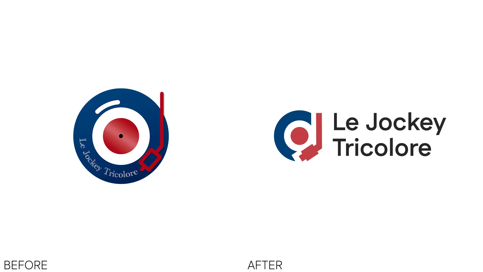
The old mark was a flat circular badge with thin script lettering that became unreadable below ~80px. The redesigned mark is a monogram, a stylized “d” fused with a vinyl record and a headphones arc, paired with a clean sans-serif wordmark that stacks or sits inline.
Design Goals
- Scalable: mark must read clearly from favicon up to signage
- Recognizable: retain the French navy + red tricolore palette
- Modern: drop the script and ornate vinyl detail for bold geometric shapes
- Flexible: symbol works standalone on dark or light backgrounds
The Mark
The new symbol integrates three ideas into one shape:
- A vinyl record (navy disc with central red label)
- A lowercase “d” for “DJ,” built from the negative space and the red accent
- A headphones arc sweeping around the right side in red
Removing the circular script tag freed the composition to breathe and work as a standalone icon (avatar, favicon, app tile) without losing brand recognition.
Typography
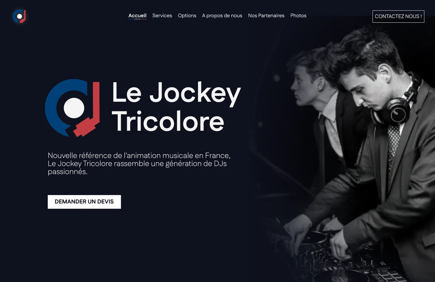
The old script was replaced with a modern geometric sans-serif wordmark set in two lines (“Le Jockey / Tricolore”) for balanced stacking. Inline horizontal lockups are also available for wide formats like website headers and event banners.
Deliverables
- Primary logo (horizontal and stacked lockups)
- Standalone symbol / app icon / favicon
- Color system built on the French tricolore (navy #0B2545, red #C8102E)
- Typography guidelines
- Website banner and social assets
What I Learned
Rebranding an established local business means respecting what customers already recognize. The tricolore palette and the vinyl cue stayed; everything ornamental went. The result is a mark that survives at 16px and still feels premium on a stage backdrop.